New visual identity
Clearer, more consistent, more Wholecontract
Design is not simply a question of aesthetics; it is a way of thinking. At Wholecontract, we believe that the way we present ourselves says a great deal about the way we work.
That is why we are introducing a new visual identity that not only represents us more accurately, but also amplifies who we are: a company that designs workplaces from a strategic perspective, creating a human and cultural impact. A brand that believes in simplicity as a language and consistency as a value.
More than an image: a statement of intent
Our new brand identity was born from the desire to be clearer, more recognisable and more consistent. This is not a cosmetic change. It is a natural evolution that reflects our way of working: rigorous, honest and elegant. A more mature and professional brand, but also a warmer and more emotional one.
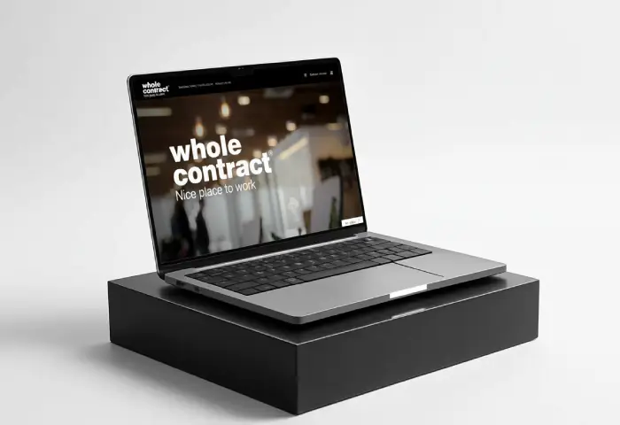
We have refined our typography, making it more geometric, clean and precise. Black now takes centre stage, replacing cyan as a symbol of solidity, quality and timelessness. Arranging the brand name over two lines also provides balance, versatility and maximum legibility across digital environments.
“Nice Place to Work” is more than a brand signature.
It is an attitude.
Our new brand signature is not simply a tagline. It is a promise: to transform spaces into places that inspire. Nice place to work has become an essential part of the brand, acting as a hallmark that encapsulates our purpose, style and point of difference.
From site signage to an email signature, every application communicates the same idea: Wholecontract is strategic design centred on people.
Functional beauty
The redesign reflects a clear philosophy: less is more. We have removed the unnecessary to make room for what truly matters. We have chosen clean structures, a clearly defined visual hierarchy and an aesthetic that combines minimalism with character.
This new identity does more than improve our visual communication. It also aligns the brand with the way we work and with the experience we want to offer: professional, inspiring and clear.
A brand you can see—and feel
Every element of this new identity—from the typography to the Nice place to work signature—has been designed to convey trust, quality and purpose. So that when someone sees our brand, they not only recognise us, but also understand what we do and why we do it.
Because at Wholecontract, design always has a purpose.
Share on social media